HumanPilot: first spatially-resolved transcriptomics study using Visium
Would you prefer a video walkthrough over reading this blog post? Check out this explainer video 🎥
A few years ago now (2021) we published a study we refer to with a very generic name: HumanPilot (Maynard, Collado-Torres, Weber, Uytingco et al., 2021). In this peer-reviewed study, we were the first ones to use a commercially available technology for generating spatially-resolved transcriptomics data. It’s called Visium and it’s sold by 10x Genomics. Note ⚠️ that members of that company were co-authors of our study. As we work in the Lieber Institute for Brain Development, we tested Visium with postmortem human brain data. I explained the initial pre-print (before peer-review) version of our work in a blog post back from Feb 29, 2020.
🔥off the press! 👀 our @biorxivpreprint on human 🧠brain @LieberInstitute spatial 🌌🔬transcriptomics data 🧬using Visium @10xGenomics🎉#spatialLIBD
— 🇲🇽 Leonardo Collado-Torres (@lcolladotor) February 29, 2020
🔍https://t.co/RTW0VscUKR
👩🏾💻https://t.co/bsg04XKONr
📚https://t.co/FJDOOzrAJ6
📦https://t.co/Au5jwADGhYhttps://t.co/PiWEDN9q2N pic.twitter.com/aWy0yLlR50
But enough with the fancy specific words. Here I explain the main points of why this study was so important and why it is still frequently cited several years later.
What is a fruit? Banana, orange?


When we are growing up, we don’t know what is an orange or a banana. What makes them both fruits, and why they are different.
If you look at them, touch them, smell them, you start to notice differences between them. In science, we end up trying to come up with systematic and specific ways of describing things that surround us in nature. In this case, two fruits. When you look at an orange and a banana and try to explain how they are different, you might end up slicing them.

Once you slice them, you are actively zooming in and looking at finer differences. You might end up using a microscope to notice even smaller differences.
Measuring gene activity
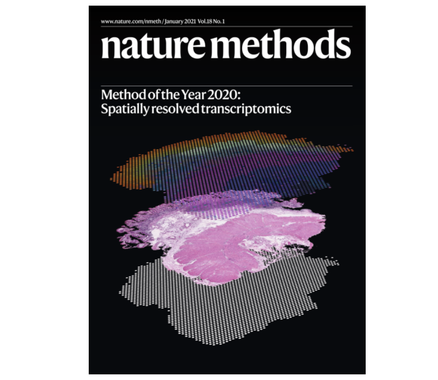
Now imagine that you want to measure gene 🧬 activity levels. Some previous technologies could measure gene activity levels by taking a chunk of tissue to have enough material for the technology to work. In the 2010s the technology was developed to measure single cells or nuclei, but you lost the spatial context. Then in 2020 the ability to measure gene activity while retaining the spatial awareness was crowned the new method of the year. The specific term is spatially-resolved transcriptomics.
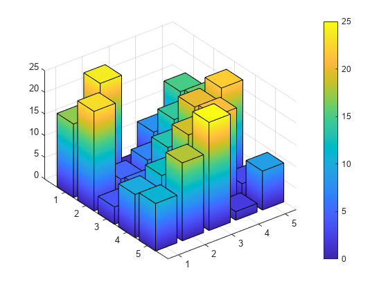
Visium in particular works by having about 5,000 circles (called “spots”) arranged in a honeycomb pattern 🐝 where we can measure gene activity levels. 10x Genomics has some videos explaining how to it works, but it basically comes down to having an X and Y map for which you can make multiple 3D barplots like this one. Say that this is the one for gene 1 where we have a flat map and the height of the bars is how much that gene 1 was active in each square.
With Visium we have 5,000 spots, or specific (X, Y) pairs and for each of them we can have about 2,000 genes measured. So imagine having 2,000 of these 3D barplots. That’s quite a bit of data and it’s exciting to think what this technology can be used for.
Human brain
Just like we were talking about bananas and oranges being two types of fruits, well, the brain has different regions. Each of them carries out specific functions and can be quite different despite them all clearly remaining a part of the brain. Just like bananas and oranges look very different but still remain fruits.
Now, scientists by training are skeptical. So with a new exciting but expensive technology, the first thing we wanted to do is to test it with a small study. That is, run a pilot study. We work studying gene activity levels from human brain samples, particularly postmortem human brain samples that were donated to our institution for research purposes. One particular region we are interested in is called the DLPFC and its important because differences between individuals that do not have schizophrenia (which we refer to as the neurotypical control group) and those that do schizophrenia have been linked to this brain region, among other reasons.

But before we can distinguish the two groups of donors at the molecular level, with the ultimate goal of helping those affected by disorders such as schizophrenia, we first needed to understand what is typically different neurotypical control (NTC) donors. Just like we can look at different healthy bananas and notice how they are different.
And so we got started with our HumanPilot study. We generated data from 3 NTC donors as you need to look at more than one donor to have an idea of biological variability.
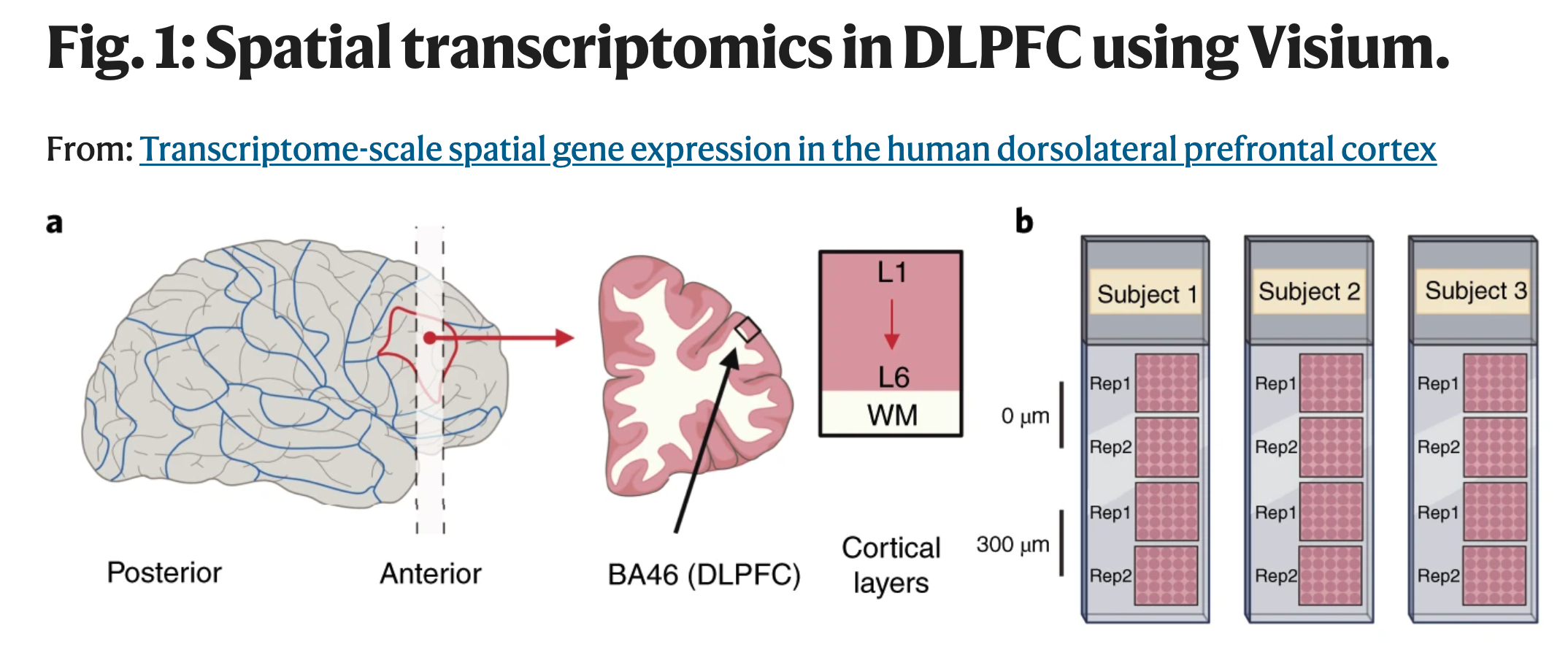
But because Visium was a new technology then, we also generated spatially-adjacent replicates (two pairs per donor). These are technical replicates in the sense that we took contiguous slices of tissue. Think of it as two paired slices of bread 10 microns apart: we generated a pair early in the loaf and one more 300 microns apart in that same loaf. Yes, things do change even when you look at things 10 microns apart, but hopefully they don’t change too much then, but should once you look at them 300 microns apart. That’s what we wanted to see.
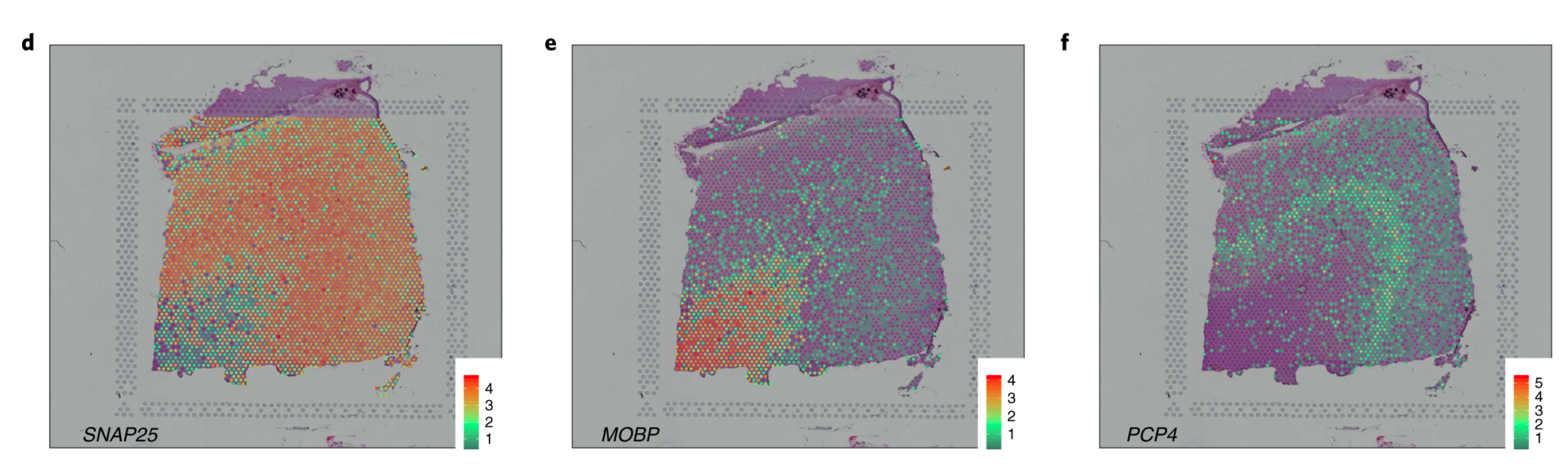
The DLPFC has been quite well studied and it was well known that gene SNAP25 is more active in neurons while MOBP is much less active in neurons. When we looked at the activity levels of these genes and could see basically how they complemented each other like a Yin and Yang symbol ☯, we were very excited.

We could also see more specific gene patterns, such as PCP4 which marks a specific subsection of DLPFC called Layer 5. And very importantly, this pattern was consistent among the 6 pairs of spatially-adjacent replicates we generated data for. That is, look for consistent patterns in each row from the above figure.
Tons of manual work to reproduce what we knew!
Now that trusted the technology, we could get to work. We started visualizing gene activity patterns for genes that other scientists had previously identified as marker genes for the DLPFC layers. Some have identified in other organisms such as mouse 🐁. Some, due to the nature of Visium, we could not observe them. Visium can only measure 2,000 genes instead of the 20,000-30,000 genes that you can detect with other non-spatially-aware technologies.
Our paper describing our package #spatialLIBD is finally out! 🎉🎉🎉
— Brenda Pardo (@PardoBree) April 30, 2021
spatialLIBD is an #rstats / @Bioconductor package to visualize spatial transcriptomics data.
⁰
This is especially exciting for me as it is my first paper as a first author 🦑.https://t.co/COW013x4GA
1/9 pic.twitter.com/xevIUg3IsA
Data visualization, particularly with any new technology, is always a challenge. So we developed a new software that we called spatialLIBD to visualize the data (Pardo, Spangler, Weber, Hicks et al., 2022). In particular, we built spatialLIBD in a way that enabled members of our team to assign each Visium spot from our 12 tissue slices to one of seven categories: gray matter layers 1 to 6, and white matter. That was a lot of work! Many other people now refer to it as the “ground truth” although we know it is not. In total, we had 47,681 spots or an average of 3,973 spots per tissue slice. Imagine having to label that many fruits, you are bound to make some mistakes!
This was a terrific amount of work, and it is has been a fundamental reason why our study has been so well cited so far. Before I get ahead of myself, now that we have labeled all these spots, we can collapse the data and perform several types of analyses. Of them is looking at the different layers and white matter (WM) from the 12 tissue slices using principal component analysis (PCA). For a lot more on the mathematical theory of PCA check Wikipedia. What matters here is that PC1 explain the most differences, and we can see the WM points in black on the left side, clearly separated from the other points. Then PC2 is associated with L1 in pink at bottom of the Y-axis, to then L2 in blue, L3 in green, L4 in purple, L5 in yellow, and L6 in orange.
That was awesome! Yes, white matter is very different from gray matter (as shown in PC1), but then also the gray matter layers are different from each other in a sequential way (as shown in PC2). All of this was known before our study, but it always feels great when you can use a different technology to reproduce previous findings.
Finding and validating new DLPFC layer marker genes
Is that it? Of course not. Other technologies and laborious experiments were needed to find some marker genes for the DLPFC layers. But now we could identify other ones. So that’s what we did. Not only did we find genes that can help us separate these layers from each other, but we then proceeded to verify a few of them using other experiments.
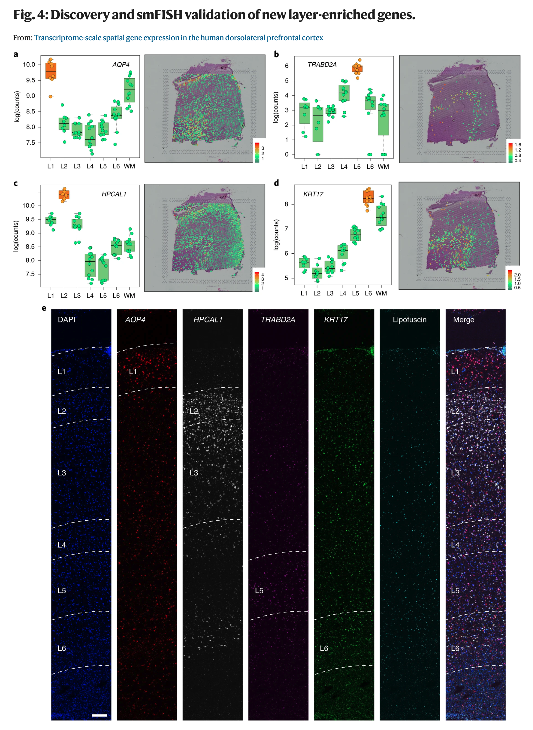
The above figure showcases some of these new marker genes that have higher activity levels in the layer they mark. It doesn’t mean that they are not active elsewhere. Though if you are interested in finding on/off marker genes, we have computational methods for that too nowadays implemented in our DeconvoBuddies software.
We also propose and evaluate a new method for selecting cell type specific #markergenes for deconvolution: #MeanRatio implemented in #DeconvoBuddies (soon to be submited to @Bioconductor) #rstats
— Louise Huuki-Myers (@lahuuki) April 15, 2024
🛠️https://t.co/del9EjmBwQ pic.twitter.com/5PQk18yDrt
What about disorders? How does your HumanPilot study help us understand them?
As you have followed the story so far, our data is from 3 neurotypical control donors. It’s not like we can use their data (n = 3) to find what is overall different between neurotypical control donors and individuals affected by other brain disorders. But what we can do is ask, is there a significant overlap between the DLPFC layer marker genes and genes that have been associated with specific brain disorders?
So we obtained several gene lists from previous studies with much larger sample sizes that compared NTC donors against those affected by certain brain disorders. Some of these studies are based on gene activity levels, some of them are based on DNA variants which they then link to genes by proximity. One set of studies we looked at were those investigating autism spectrum disorder (ASD). What was fascinating to us is that two studies (SFARI and ASC102) had similar enrichment between ASD-associated genes and L2 and L5 marker genes. But the ASC102 study can be broken apart into two sets, ASD53 and DDID49, and each is associated with just one layer (L5 and L2, respectively).
So spatially-resolved transcriptomics could be used to further locate to specific tissue architectural elements the genes that have been implicated in different diseases, disorders, or biologically-relevant groups. Even small pilot studies like ours have the potential of helping us understand how some of these genes are distinctly spatially active.
Fueling the development of methods, and benefiting from it
We knew that this wasn’t going to be the end. Our HumanPilot was just the beginning and for our research groups, it effectively started a whole new wave of studies. We are now using Visium and other technologies to dive into other brain regions which aren’t necessarily as well studied as the DLPFC, or to look at differences between specific sets of groups of donors. Yet, this isn’t our first time witnessing the emergence of a brand new technology. We are well aware that each new technology has its imperfections, biases, and sources of measurement noise. One particular challenge we wanted help with was the process of manually annotating thousands of Visium spots.
In our dataset, we had manual annotations. So we went ahead and tested a few different ways of grouping spots, known as clustering.
Any computational clustering method will produce results and pretty pictures. By eye, sometimes you can tell quite easily what is a widely inaccurate result from one that seems decent enough. But comparing decent results from two methods by eye is very challenging.
We used a measure called adjusted rand index to do this, where higher values are better. Here we did a few key things:
- We made our data public as soon as we pre-printed our study in Feb 29, 2020.
- That is, we didn’t wait for a full peer-review process (our paper was published in Feb 8th 2021, nearly a year later). Openly sharing data early can help accelerate science.
- We made our data easy to access in a easy to use computational format.
- specifically,
SingleCellExperimentR/Bioconductor objects downloadable throughspatialLIBD::fetch_data(). Nowadays, we provide the data in the more specializedSpatialExperimentformat.
- specifically,
- We showed how you can compare results from clustering methods to the manual annotation using the adjusted rand index metric.
Within months, others such as the authors of BayesSpace in September 5th 2020, started to use our HumanPilot data to evaluate the performance of their sophisticated spatially-aware clustering methods.
This rapid pace of development has been great to witness. We now have been able to see how others have used our data to improve their methods, and we can now benefit from them by applying them to new Visium datasets without necessarily having to perform manual annotations.
What followed
Naturally we heard questions about what could happen if we had a larger pilot study. If we looked at different sections of DLPFC (anterior, middle, posterior). Today, our follow up peer-reviewed study was published involving data from 10 NTC donors across the anterior-posterior axis for a total of 30 Visium tissue slices. I’ll soon explain this follow up study, which we called spatialDLPFC, in its own blog post. Louise A. Huuki-Myers already wrote an excellent spatialDLPFC overview blog post which I encourage you to read.
New in @sciencemagazine: our work from @LieberInstitute #spatialDLPFC applies #snRNAseq and #Visium spatial transcriptomic in the DLPFC to better understand anatomical structure and cellular populations in the human brain #PsychENCODE https://t.co/DKZqmG4YDi https://t.co/Tjp2OjTo63 pic.twitter.com/vQbjts2JtQ
— Louise Huuki-Myers (@lahuuki) May 23, 2024
Something I want to highlight is that my colleague Kristen R. Maynard and I were co-first authors of HumanPilot, and are now co-corresponding authors of spatialDLPFC. HumanPilot started in 2019 and was published in 2021, spatialDLPFC started in 2020 and was published in 2024. These projects have large cycles and it takes a whole village, or a federation of villages, to get them completed and published. So I want to shout out all past colleagues. We couldn’t have gotten to where we are without their work! And thank you for everyone who has been interested in our work and has been using it to learn new things. We also learn through you. Thank you!!!
Self-assessment can be repetitive - or maybe not? 🤔 This caught my attention in recent spatial omics literature (but apparently not the authors'?)... "More of a comment than a question" that we need benchmarks. pic.twitter.com/KPRTf0vUxv
— Helena Lucia Crowell (@helucro) November 29, 2022
Hopefully you have a better understanding of our HumanPilot study now and can recognize the origin of all the figures like the ones above. If you want more, check out this journal club presentation by Cynthia Soto and Daianna Gonzalez-Padilla. They are members of my lab, but were not involved in this study at all. So their presentation has a fresh perspective.
Finally, feel free to checkout our code and more details at https://github.com/LieberInstitute/HumanPilot.
See you around! 😊
Acknowledgments
This blog post was made possible thanks to:
References
\[1\] C. Boettiger. knitcitations: Citations for ‘Knitr’ Markdown Files. R package version 1.0.12. 2021. URL: https://CRAN.R-project.org/package=knitcitations.
\[2\] K. R. Maynard, L. Collado-Torres, L. M. Weber, C. Uytingco, et al. “Transcriptome-scale spatial gene expression in the human dorsolateral prefrontal cortex”. In: Nature Neuroscience (2021). DOI: 10.1038/s41593-020-00787-0. URL: https://www.nature.com/articles/s41593-020-00787-0.
\[3\] A. Oleś. BiocStyle: Standard styles for vignettes and other Bioconductor documents. R package version 2.32.0. 2024. URL: https://github.com/Bioconductor/BiocStyle.
\[4\] B. Pardo, A. Spangler, L. M. Weber, S. C. Hicks, et al. “spatialLIBD: an R/Bioconductor package to visualize spatially-resolved transcriptomics data”. In: BMC Genomics (2022). DOI: 10.1186/s12864-022-08601-w. URL: https://doi.org/10.1186/s12864-022-08601-w.
\[5\] Y. Xie, A. P. Hill, and A. Thomas. blogdown: Creating Websites with R Markdown. Boca Raton, Florida: Chapman and Hall/CRC, 2017. ISBN: 978-0815363729. URL: https://bookdown.org/yihui/blogdown/.
Leonardo Collado-Torres
Investigator @ LIBD, Assistant Professor, Department of Biostatistics @ JHBSPH
#rstats @Bioconductor/🧠 genomics @LieberInstitute/@lcgunam @jhubiostat @jtleek @andrewejaffe alumni/@LIBDrstats @CDSBMexico co-founder